Channel: Ziegler Art

Forwarded from National Socialist Creators Club
ZIEGLER DECODED #6 – "Himmler"
Upon the request of my friend and colleague, I’ll be presenting to you the structure of my “Himmler” piece today.
1) This picture has no reference – it was an experiment to some degree, on how to achieve a good composition using simple shapes and generally flat image.
2) Font that I’ve used was Caviar Dreams.
3) Background clouds are created using Fog Brushes – just install them, regulate the size and place on the image so it looks fitting.
4) You will find that majority of layers I’ve created are shapes. Simple shapes (doorway, road) can be created using Shape (Rectangle, Ellipse etc.) tool. Most useful and updated tutorial I’ve found on that topic is this Shape Tool Explained. Watch it to learn all the basics.
5) Some of the shapes, however, are used with reference image. I apologize in advance – I haven’t saved the original image of Himmler I was using as a reference, but the point is that, after creating a selection (we’ve already talked about different tools you can use to create those), I converted that selection into shape. You can easily do that by going to the Layers panel (your selection must be active), selecting the Paths bookmark and then, at the very bottom of that bookmark, you will see an icon of a circle with four anchor points named “Make work path from selection”. After you click that icon, Photoshop will create a work path in the shape of you selection, and you can finalize the process by coming back to the Layers bookmark and creating a Solid Color adjustment layer. This tutorial doesn’t explain this mechanic entirely, but it is good enough to start and then experiment a bit on your own. Eagle, skull and collar insignias are created with this method – I simply selected the objects I wanted to turn into shapes, and did so, playing around with them afterwards using Warp option from right-click menu.
6) Bottom text is actually two texts, some parts of which are hidden with layer masks. Those masks are created by right-clicking on the icon of the layer of Himmler’s shadow (by doing so making a selection out of a layer) and turned into a layer mask. Simple!
7) Shining. Now, in order to do that, I had to use Select – Color Select tool. Before doing so, however, I have hidden the layer with clouds – because I didn’t want to select them. Now, after choosing that Color Selection tool, I’ve picked the white color from my image and, because my image was originally highly contrast, black-and-white, I got the correct selection from the pop-up window immediately. Then, I made that selection into a new layer by selecting Solid Color adjustment layer, and applied the Outer Glow effect on that layer (double-click the layer, not the icon or the name of the layer, and tip the Outer Glow option, then play around a bit to achieve the result you want). This tutorial and many others out there will help you master this tool.
8) A little tip for you all, zieglerians – you will see that all of my shadows are created using Gradient Fill adjustment layer. Why so? Because shadows are usually darker at the base, and lighter at the very edge. So, next time you create a shadow, try to remember that tip. More professional approach on Shadows Creation – in the link.
Forwarded from National Socialist Creators Club
ZIEGLER DECODED #7 – “The White Queen”
Another request from my friend to decode my work completed. Enjoy and learn!
1) This piece has a reference image, and is not that unique. Check out the original one here.
2) Font is called Rockwell. There were some additional manipulations with the text tool. As you see, some letters are regular, and some are bold. You can do that by left-clicking once on your text (with Type Tool selected), then, when the text box will be active, you can select the text you want to turn bold, and then in a Character window that will open, you select an option (Bold) in a menu next to the one with your font. Done!
3) Background consists of three independent layers, interacting with each other – Red Color Fill, White Color Fill, and Chessboard. White Color Fill is additionally edited with layer mask – after creating a layer, I’ve made a selection of inner rectangle (made with Guides) and turned it into a layer mask. After that, I’ve selected the layer mask (not the layer icon itself, but the one next to it), inverted it using Ctrl+I hotkey, and by doing so created a white frame. Next thing I did was select one of the brushes with curved edges and started gently editing the border, moving one brush at a time. Before doing so, be sure to check the colors in the bottom-right corner of your screen – they must be black and white.
4) All chess pieces are based of the reference image I’ve found on the Internet. If you open the smart objects, you will see the original images. As for the Queen – it actually consists of three parts – the Queen herself, the eagle and the shadow. Again, check out the smart object. After balancing the colors of the Queen and the eagle with curves adjustment layer, I’ve added a shadow on the final image.
5) For the overall “scratched” effect, I’ve used a couple of filters from the Filter Gallery. Here is one very good tutorial on that tool and how you can combine different filters to achieve perfection. In addition, I’ve put some texture layer for the overall effect.
6) Now, you’ve probably noticed that I am using smart objects a lot. Not only it is done for you to explore the image structure in detail, but also because all the effects that you apply to the smart objects are saved and can be edited or adjusted later – you’ll see those two overlapping circles on the layer, called "Indicates filter effects”. Now, if you apply those filters to the rasterized image – they will be applied for sure, but you will not be able to see them in the layer menu, and further editing is impossible. Just a useful tip for you to be armed with.
BoomRocker
Simultaneous Chess Exhibition
There has been a lot of charity activity going on at work, which of course is a good thing. The next one up is a simultaneous chess match. A renowned chess champion, CHALLENGES all HCA Nashville-ba…
Forwarded from National Socialist Creators Club
ZIEGLER DECODED #8 – “A Hero Will Rise”
This is very simple poster, with no complicated techniques or advanced tricks used – just a collection of layers interacting with each other through blending modes and enhanced with adjustment layers.
1) This piece has a reference image, and is not that unique. Check out the original one here.
2) Fonts are Centaur and Bebas Neue.
3) If you have a good reference image, but you don’t know what font is used there, try using Font Identifier. If you don’t find the exact font you’re looking for, at least this service will give you the most similar ones.
4) We can roughly divide the image roughly on four layer groups – two text groups, soldier and a background. If you check each and every one of those groups, you will find that all of the original images were of different color tones – from black and white (Volkshalle) to colorized (soldier). All of them had to be adjusted to match each other and the overall color scheme of the poster. That is done with Gradient Maps in this case - but you can also use Hue/Saturation,
5) Volkshalle image is additionally adjusted to be more round – with turning into a smart object and using “Warp” option. Soldier was given an additional custom lights and shadows (using simple brush and changing the blending mode of those layers) to look less flat and more integrated into the overall picture.
6) I used more than one dust layer to create the necessary effect. I wasn’t able to match the original image exactly – but it wasn’t intended, the ultimate goal is to create similar image, not the exact replica.
7) Notice that there are no filters, except the finishing - and traditional, by now, - Camera Raw Filter. Be sure to use it every time to balance your piece, add some noise, contrast etc. The power of this tool is often underestimated.
Posteritati
Gladiator Original 2000 U.S. One Sheet Movie Poster
Original 2000 U.S. one sheet poster for the film Gladiator directed by Ridley Scott with Russell Crowe / Joaquin Phoenix / Connie Nielsen / Oliver Reed.
Forwarded from National Socialist Creators Club
ZIEGLER DECODED #9 – “The True Minority”
This poster of mine is simple, substantial and unique – how about we discuss today what it consists of?
1) As usual, fonts and brushes: Gill Sans MT Ext Condensed Bold Font and Crack Brushes.
2) We can roughly divide the poster in four layer groups – first, the background; then, the pie chart; thirdly, the font group; and finally, the texture and overall Camera Raw adjustment.
3) Background consists of three layers – gradient fill as a basis, photo of black crowd and Threshold Adjustment Layer. In this case, I used it to show the crowd as a rough, edgy mass that overwhelms the light zone (corresponding to the idea of the poster). Here is more detailed Threshold Tutorial, with which you can adjust images to your liking. Notice the blending mode of black crowd layer.
4) Second group consists of three layers and two adjustment layers. Firstly, we create the basis – the circle, which will be the foundation of our pie chart. That can be easily done using Ellipse Tool. Then, we have the Polygon Tool, which is adjusted to look like a segment of the pie chart. It extends beyond the circle, in order to visually connect the center of the poster with its down part. Now, in order to find the exact proportions – how exactly 8% should look like on a pie chart – I used some website that calculates that. Nothing specific, there are lots of those available online. Then, I used that image as a reference to adjust the size of the triangular section. There are a couple of layer masks here – first, there is a layer mask on the ellipse that was created by making a selection from a polygonal tool layer, then extended the selection with Select – Modify – Expand on the control panel, and turned that into a vector mask for the ellipse tool. The 8% text is also created in the same way – only this time, I applied selection to the layer mask directly, without expanding it. Finally, I’ve subjugated the third layer, a photo of a white couple, to the triangle. I’ve added Reduce Noise filter in order to smoothen the picture, making it contrasting with dark, edgy background. Black & White adjustment layer was added for the same reason.
5) Third group is a text layer group. Everything is very simple here – two Horizontal Type Tools grouped together, and layer mask of that group edited using the Crack Brushes. Simple as that!
6) Finally, some texture and adjustment layers. Texture layers, although entirely optional, can give your poster a more natural look and enhance the piece overall. Not to mention the Camera Raw filter, which I will never grow tired of praising.
Brusheezy
Cracks Free Brushes - (251 Free Downloads)
251 Best Cracks Free Brush Downloads from the Brusheezy community. Cracks Free Brushes licensed under creative commons, open source, and more!
Forwarded from National Socialist Creators Club
ZIEGLER DECODED #10 – “Bürgerbräu-Putsch 1923”
We celebrate the anniversary of the Beerhall Putsch these days, so I’ve decided to decode of my posters devoted to this specific date. Learn and enjoy!
1) Reference Image – Blade Runner Movie poster
2) Fonts used: Tw Cen MT, Blade Runner Movie, BigNoodleTitling.
3) Seven layer groups – Background, Portraits, Adjustment, Camera Raw, Coloring, more Adjustment
4) Background - Photo of the Bürgerbräu Putsch events enlarged and blurred a bit + shadow below the future text, in the bottom part of the poster (Rectangle Tool with Gradient Fill) + custom Light done with basic brush + Gradient Fill for the visual division of the poster in two parts.
5) Portraits – all of them are adjusted to be black and white, after which colors from the gradient fill layer are applied in order to both show the visual division of the main characters and harmonize the original photos with the color palette of the poster. Be sure to check the blending modes and layer subjugations.
6) Text – the name of the “movie” is stylized to a Neon theme. This was not done in the original poster, I just decided to experiment a bit. This Tutorial and many others will teach you the basics of the Neon Font – go and check them out!
7) Adjustment – I was trying to lighten up the picture with those adjustment layers and, quite frankly, did a very poor job. But you can do better, and experiment more. Camera Raw filter is very traditional in my works, so nothing much to say here – just check all valuables and bookmarks in the Camera Raw filter window.
8) Coloring was done in order to turn dual-toned image in something a bit more colorful. It was done in the following way – firstly, I created a Solid Color and then made a layer Mask our of a Color Range selection (Sample Colors option). Of course, I adjusted them a bit later, where needed, using brush on the Layer Masks.
9) Finally, some color adjustments and dark beams, trying to imitate the original poster.
Starstills.com
Blade Runner 2049 Original Movie Poster - Advance Style
Blade Runner 2049 Original Movie Poster – Final Style, Authentic memorabilia. FREE UK Delivery and Worldwide fast shipping.
Forwarded from National Socialist Creators Club
ZIEGLER DECODED #11 – “Ziegler’s Magazine Cover”
This was the piece that motivated me to learn effective colorizing technique. I believe that decoding this image will be quite useful to everyone who is interested in creating something similar. Its structure and guide is surprisingly simple, so let’s dive into it!
1) Tools - any magazine cover as a reference image; Fonts: AvantGardeCTT, Vogue.
2) Five groups of layers that interact with each other – Background, Background Text, Ziegler’s portrait, Upper Text, Camera Raw.
3) Background – simply two layers, a Gradient Fill and a photo of Reich Chancellery interacting with each other.
4) Background Text - Some fonts don’t have an apostrophe – no worries there, you can easily turn your coma into abovementioned apostrophe. Actually, do not be afraid to experiment with fonts in your posters – bend them, place letters on different height, scale them etc. Sky is the limit when you want to harmonize your font with the overall spirit of the poster.
5) Ziegler’s Portrait – you might think that whatever was done to Adolf Ziegler’s portrait is quite complicated, but you are wrong. This process is simple and can be roughly divided into two parts – firstly, you have to colorize the photo that you have; secondly, you cut the result in separate parts. Both of those parts have very detailed tutorials – the best ones that I’ve found are Colorize Black and White with Realism and Creative Face Manipulation Effect. Check them out!
6) Upper Text – Pretty usual edit, except the fact that size and color of the text can be different within the same Horizontal Type objects. To do that, simply click on your text with the Horizontal Type Tool active, select parts that you want to customize and change whatever parameters you wish in a Character window.
7) Traditional Camera Raw filter atop. Double-click on the filter below the layer on the smart object to explore all the changes applied.
Forwarded from National Socialist Creators Club
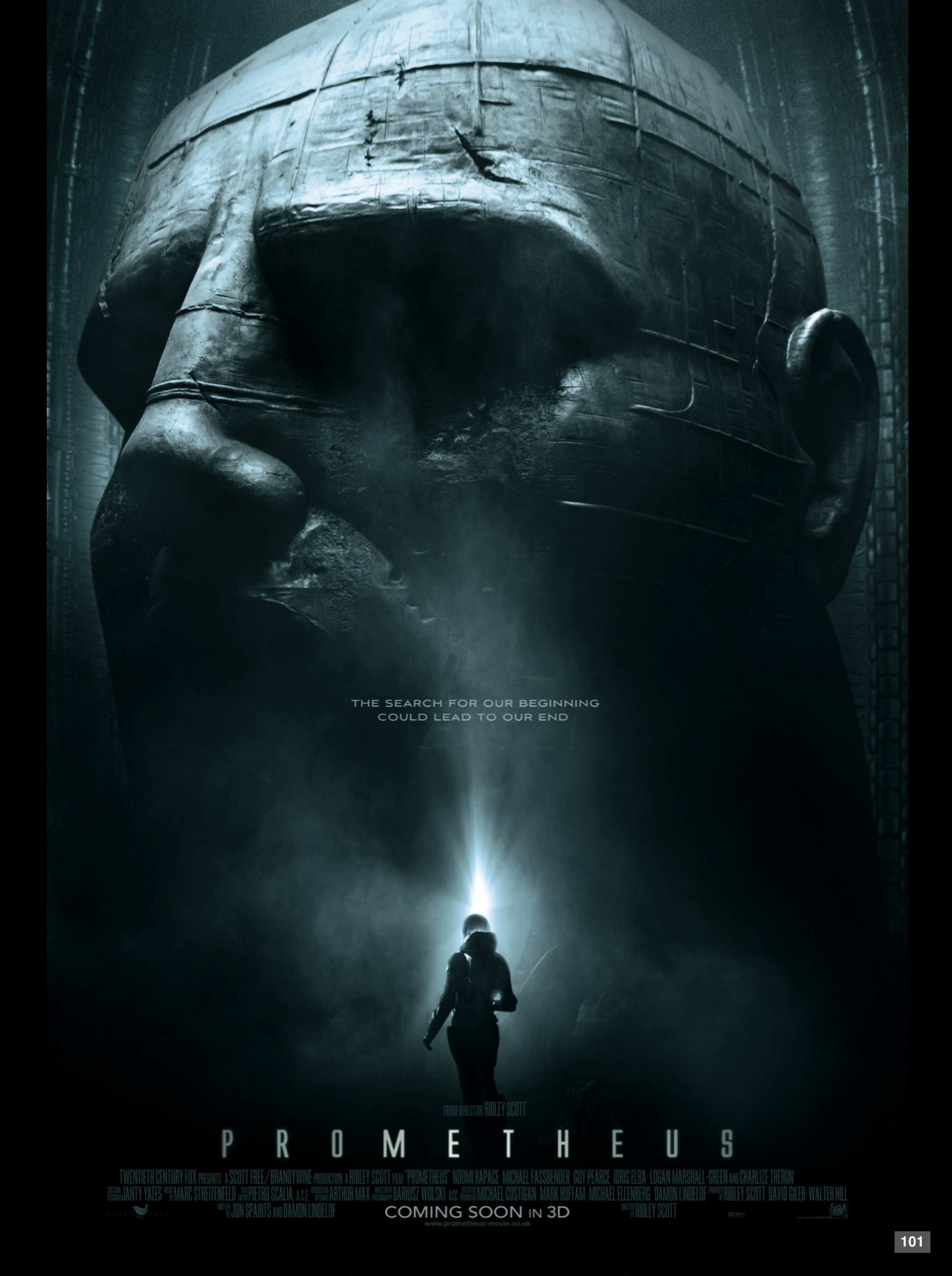
ZIEGLER DECODED #12 – “Prometheus”
Reference image: “Prometheus” movie poster, for it gave me a very powerful feeling of absolute supremacy of the sculpture. And the overall idea of an old, powerful civilization long forgotten resonates very well with my attitude towards the Third Reich.
Fonts: Copperplate Gothic Light, Alien League Bold.
Brushes: Lens Flares.
Seven groups of layers: Background, Fuhrer’s Sculpture, Fog, Light, Soldier, Text and Final Adjustments;
1) Background – as in the reference image, there is a very little section of the background visible, but it doesn’t mean that you should ignore it. Background image in this case is modified picture of Volkshalle – its’ dome perfectly fits the perspective of the image. Bear in mind that, for the purpose of more visually harmonious image we better make all layers black & white, so that further adjustments can be applied easily. Light halo is added to slightly clarify the borders of the Fuhrer’s Sculpture layer, to ensure smoother transitions.
2) The Fuhrer’s Sculpture consists of five layers overall – firstly, it is the sculpture itself, cut out from the old photo. Now, because I had to scale it, I turned it into a smart object in order not to lose quality, but then rasterized it, for nothing else had to be done with it. I didn’t worry about pixels – further adjustments leveled that little trouble. Now, shadow part is a bit tricky – you’ll require some knowledge of basic human anatomy to visualize how the light is falling on the sculpture for a more powerful edit. However, you can just consult the reference image. One shadow layer is not enough, for it will look too sharp, and you don’t want that. For a more smooth, realistic transition, you’re going to make another shadow layer with much lighter shade of black, yet not completely white. Check out the blending modes. Now, the final touch would be to add some texture. Be sure to choose high-definition textures, to create an impression that this sculpture is indeed colossal. To make those flat textures look more realistic, you can easily warp them (Right-Click on the layer and select the corresponding option). P.S. The Ear layer is just a small part of sculpture’s ear that was missing on the photo, and I had do draw it manually.
3) Fog layer consists of two separate layers of white fog on the black background. Layer masks are used to adjust the fog into the shape similar to that on the reference image and make a transition between fog pictures and background smoother.
4) Light layer can be divided into three sub-layers – the clear “doorway”, the light beam coming up across the image, and a light halo around the door. All of those layers are created with brushes that I’ve mentioned at the beginning. For the doorway effect, you can use simple round brush with Hardness around 50%, put one on the separate layer and then stretch it with Transform option (Ctrl+T). Make it look like a doorway, and place it behind the soldier.
5) Soldier – now, the original image was also rasterized, but you can easily find similar ones online by searching “Wehrmacht soldier”. Main criteria for me were – we must see only the back of the soldier, preferable with light coming from background, so it is more harmonious with our own image. Again, we adjust the layer by turning it black & white; add a shadow atop of everything.
6) Text is simply put in, lower one (Prometheus) was adjusted so that distance between characters correspond to the reference image. Also, you will notice that there is a minor gradient on the font – again, to better duplicate the original picture, where gradient coloring is present as well.
7) Final adjustment layer consists of Camera Raw filter (I especially urge you to check the Split Toning bookmark in that filter – with those adjustments I could bring back that grim, blue-green dichotomy of colors). And one more thing – to adjust the shadows and make them softer, I’ve made a color selection from the final Camera Raw layer and applied it to the Solid Color layer with softer shadow shade).
Forwarded from National Socialist Creators Club
Prometheus - DECODED.psd
92.7 MB
Forwarded from National Socialist Creators Club
ZIEGLER DECODED #13 – “Kolibri”
Reference image: Suburbicon movie poster. Fonts: Heavitas and Century Gothic Regular.
Today, I think it would be best for me to describe the compositional work on the reference image, analysis and production idea rather than technical details – since the latter can be found in the file itself. So, let’s dive deeper into the way Zieglerians see the posters and utilize them.
When we take a first analyzing look at the reference poster, we can roughly divide the layers into several main groups – firstly, there is a base image, a photo of a main character.
Secondly, there is a zoning present, which in the case of the poster reflects the zoning of suburban area. We are immediately taking note that this zoning can be organized differently. Same goes to the group of little houses below – we understand that they won’t do in our case, but they are playing an important part in the overall composition, so we should replace them with something.
Thirdly, there are photos of secondary characters, some of which are colored in red, and some of them are not – and notice that one of the photos is steeping out of the framing. It visually shows the importance of the figure depicted, so we take that in mind. Finally – the font, but it is easy. Adjustment layers are also quite traditional and come at the very end.
As you can see, it is very simple. We just have to re-image the poster now. At the base we put the Fuhrer himself – the main figure of the party. For the background we use texture that would add a bit of “age” into our poster, but not too much. The zoning, as careful eye can spot, is done in form of swastika. We pick Strasser as our “important figure” – as main leftist opponent of Hitler in the party, second comes Rohm, whom we place in the middle of the picture, to visualize his importance as well. We put SA parades and SS regiments in their separate sections, to underline their important role in the described event, and add SA soldiers’ shadow, copied and pasted as many times as we need, instead of houses. We arrange the names and the fonts accordingly. As for the coloring – we could have painted zones with SA, Rohnm and Strasser red, symbolically telling that they were the ones murdered during the “Kolibri” operation, - but it would add to much of red color on the map, which we don’t need, for everything has to be properly balanced. We make sure to copy the reference poster in technical details – shining around the characters, overall style, but not necessarily the message.
Hope this little analysis of mine was helpful to you looking through those layers. It ain’t much, but it’s an honest work.
IMDb
Suburbicon (2017)
Julianne Moore, Matt Damon, and Oscar Isaac in Suburbicon (2017)
Forwarded from National Socialist Creators Club
Kolibri - DECODED.psd
124.6 MB
Forwarded from National Socialist Creators Club
THE NEW CHAPTER
Today is a great day, my dear zieglerians. At this very day, one year ago, I created this channel and started my work in applying the principles of design into our National-Socialist community.
This year was amazing. I was able to practice design like never before in my life; I did my best at commemorating the glorious pages of our White History. But more importantly, pieces from this channel have inspired some people to start their own channels. I was trying to not only do the art myself, but also to teach and pass my techniques to others. I don't know how many of you will use them - I was just happy to help.
And today, I must say my final goodbye, for from this day, I will no longer be leading this channel. Due to numerous personal, health-related reasons, I have decided that it would be better to pass the ownership to my trusted comrades.
I hope that this channel will be very soon led by many more tallented designers and devoted national-socialists, who will carry on the cause of Adolf Ziegler. But untill that day, this channel will be conserved, serving as a reminder and inspiration for others.
As my final wish, I would like you all to support the channels that have been a source of inspiration for me, supported me and share the same artistic spirit of Ziegler:
○ The Artwork of Friendly Father - true Zieglerian, my spiritial successor and one of the most tallented designers I've seen on Telegram.
○ JinjerZilla - when you say "True White Artist", you mean this man. His cartoons and pictures served as greatest inspiration for me.
○ Miss Gorehoud Art - one of the closes friends I've found in our community. Her channel is lractically radiating positive atmosphere and cozy feeling of community.
○ Fashwave Images - this channels publishes all the best art our National-Socialist community creates. It is led by the same comrades whom I trust to admin this channel after I am gone.
○ Europa Wave - also one of my good friends, whose art is getting better and better, more professional every day.
○ The Heroic Ideal - this comrade of ours is never afraid to experiment and try new thins in art and design, and his achievents are amazing.
This is it, my friends. I must say that the only thing that kept me going so far were you, my dear Zigelerians. Without your support, I wouldn't last a month and would never be able to achieve what I have now. I love you all, and wish you to never lose hope and stay inspired for our Great Cause.
Glory to Victory, zieglerians.
Our Idea Will Triumph.
Forwarded from The Artwork of Friendly Father
Today is a good day, I've been asked to create some things for Ziegler's Art page. I'm very happy to take up the opportunity and while I can't be Ziegler, I can try my very best to keep the spirit alive. I hope you enjoy my first post and more to come.
Forwarded from National Socialist Creators Club
"Hail Ziegler", Adobe Photoshop
Beyond all of his technical prowess, behind the beautiful and carefully executed compositions there was an artist with vision. Ziegler showed us that National Socialism could be modern and maintain it's integrity. It could be sharp, colorful, fashionable and rival the highest levels of mainstream design. Ziegler's Art proved that we would not be contained in a realm of subculture or a "-wave". He broke down boundaries and we will never be the same.
It could be said that Ziegler's greatest contribution to NS art is not just any one of his stunning visual pieces but how he affected the standards of artists around him. If you were an artist in the NS community you would be compared to Ziegler and you would compare yourself to his level of quality. His presence compelled myself and others to constantly reflect and improve on our own work.
Thank you Ziegler, thank you for the art that inspires us all and most importantly thank you for moving us forward. Hail Ziegler.
HTML Embed Code: